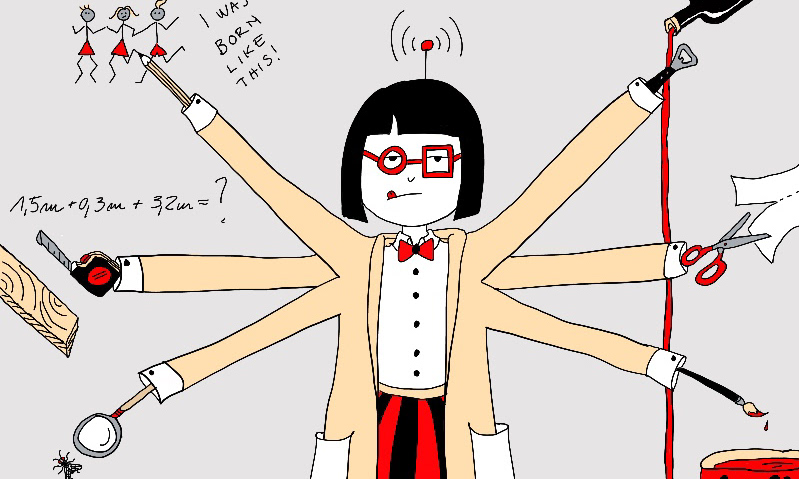
Choosing the right color scheme for your illustrations can significantly impact the effectiveness and emotional appeal of your artwork. The right colors can convey mood, create emphasis, and ensure your illustration resonates with its intended audience. Here are some tips and strategies for selecting the perfect color scheme for your illustrations.
1. Understand Color Theory
Color theory is the foundation of choosing a color scheme. It involves understanding how colors interact, the color wheel, and the relationships between different hues.
Color theory is the foundation of choosing a color scheme. It involves understanding how colors interact, the color wheel, and the relationships between different hues.
Primary Colors: Red, blue, and yellow. These cannot be made by mixing other colors.
Secondary Colors: Green, orange, and purple, created by mixing primary colors.
Tertiary Colors: Created by mixing primary and secondary colors.
Secondary Colors: Green, orange, and purple, created by mixing primary colors.
Tertiary Colors: Created by mixing primary and secondary colors.
Color harmonies are combinations of colors that are aesthetically pleasing. Here are a few basic types:
Analogous Colors: Colors that are next to each other on the color wheel (e.g., blue, blue-green, and green). These schemes are harmonious and often found in nature.
Complementary Colors: Colors that are opposite each other on the color wheel (e.g., red and green). These create high contrast and vibrant looks.
Triadic Colors: Three colors that are evenly spaced around the color wheel (e.g., red, yellow, and blue). These schemes are vibrant and balanced.
Complementary Colors: Colors that are opposite each other on the color wheel (e.g., red and green). These create high contrast and vibrant looks.
Triadic Colors: Three colors that are evenly spaced around the color wheel (e.g., red, yellow, and blue). These schemes are vibrant and balanced.
2. Consider the Mood and Message
Colors evoke emotions and can influence the mood of your illustration. When choosing a color scheme, consider the feelings you want to convey.
Warm Colors: Red, orange, and yellow are energizing and can evoke feelings of warmth, excitement, or aggression.
Cool Colors: Blue, green, and purple are calming and can evoke feelings of tranquility, sadness, or indifference.
Neutral Colors: Black, white, gray, and brown are versatile and can be used to balance other colors or create a minimalist look.
Cool Colors: Blue, green, and purple are calming and can evoke feelings of tranquility, sadness, or indifference.
Neutral Colors: Black, white, gray, and brown are versatile and can be used to balance other colors or create a minimalist look.
3. Use Color Palettes and Tools
There are numerous online tools and resources that can help you generate and test color schemes:
There are numerous online tools and resources that can help you generate and test color schemes:
Adobe Color: Allows you to create and save color palettes, explore trending palettes, and apply color theory principles. click-click
Coolors: Generates color schemes and allows you to adjust them to your liking. click-click
Paletton: Helps you create color schemes based on color harmony principles. click-click
Coolors: Generates color schemes and allows you to adjust them to your liking. click-click
Paletton: Helps you create color schemes based on color harmony principles. click-click
4. Think About Context
Consider where and how your illustration will be viewed. Colors can look different depending on the medium (print vs. digital) and lighting conditions. Always test your color schemes in the final context to ensure they look as intended.
Consider where and how your illustration will be viewed. Colors can look different depending on the medium (print vs. digital) and lighting conditions. Always test your color schemes in the final context to ensure they look as intended.
Digital: Colors may appear brighter on screens. Ensure good contrast for readability.
Print: Colors can appear darker or more muted in print. Use CMYK color mode for print illustrations to ensure accurate color reproduction.
Print: Colors can appear darker or more muted in print. Use CMYK color mode for print illustrations to ensure accurate color reproduction.
5. Get Feedback
Don’t be afraid to ask for feedback on your color choices. Sometimes, a fresh set of eyes can catch things you might have missed. Share your work with colleagues, friends, or online communities for constructive feedback.
6. Stay Inspired
Look at other artists’ work for inspiration. Pay attention to how they use color to convey mood and emotion. Nature, fashion, and even everyday objects can also provide color inspiration.
Look at other artists’ work for inspiration. Pay attention to how they use color to convey mood and emotion. Nature, fashion, and even everyday objects can also provide color inspiration.
Conclusion
Choosing the right color scheme for your illustrations is a crucial step in the creative process. By understanding color theory, considering the mood and message, using helpful tools, thinking about context, getting feedback, and staying inspired, you can create visually stunning and emotionally impactful illustrations. Happy illustrating!
Choosing the right color scheme for your illustrations is a crucial step in the creative process. By understanding color theory, considering the mood and message, using helpful tools, thinking about context, getting feedback, and staying inspired, you can create visually stunning and emotionally impactful illustrations. Happy illustrating!


